Friday, September 25, 2015

The Bold Red Card: You Made It Happen!

Sooo, last time, I gave y'all five choices to pick from, and option #5 got the most votes out of them all.  I'm sorry I'm two days late to get this post out, by the way.  You know, school sort of gets in the way.

I'll tell you a little bitty tiny secret: I was rooting for that one all along!  Now I'll tell you another secret, which in fact, is really not a secret.  At first I only had four choices, and was going to only use those, but you may know that I hate the number four, and so I just couldn't bear to have only four choices.  So I tried and tried for a good while to come up with a fifth choice, but it wasn't happening!  Finally I had almost given up, but I decided to take a break, and then come back.  And guess what!  After stretching my brain to it's uttermost end, this brain in this head finally thought of one more option, and it turned out to be my favorite.  At that point, I considered simply doing a blog post on that one, but I had already thought of letting y'all choose, and anyway, I liked the other choices too, so I went with the poll.  Nevertheless, I'm glad the last one got picked!

Before I show you the finished card, I'll just walk you through a short tutorial of how I made it up to this point.

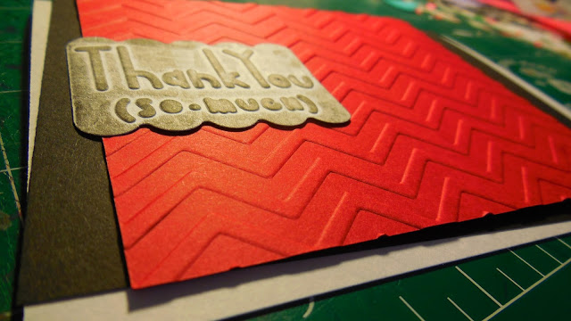
I first started with a 5 and 1/2 by 4 and 1/4 inch card, as always, folded on the long side.  Then the black piece is 5 and 1/4 by 4 inches, and the red is 3 and 7/8 by 4 and 1/2 inches.

The "thank you" piece is a scrap that I had been looking for a use for, but was having trouble with.  It's a little bigger than 2 by 1 and 1/2 inches.  In case you're wondering, it was made by embossing a white piece with one of my Thank You embossing folders from Lifestyle Crafts (I couldn't find a link to put in so y'all could see what I'm talking about), and then I ran over it with my rubber brayer in black ink, which had already run over something else, so the ink wasn't so thick when it went over the thank you piece.

By the way, I'm sorry if the red here is overly bright, and looks sort of orange-y.  In real life, it's a deep, dark red, and not at all orange.  Deep colors are the best.
Emboss the red so that the chevron goes horizontally.  I used this one.
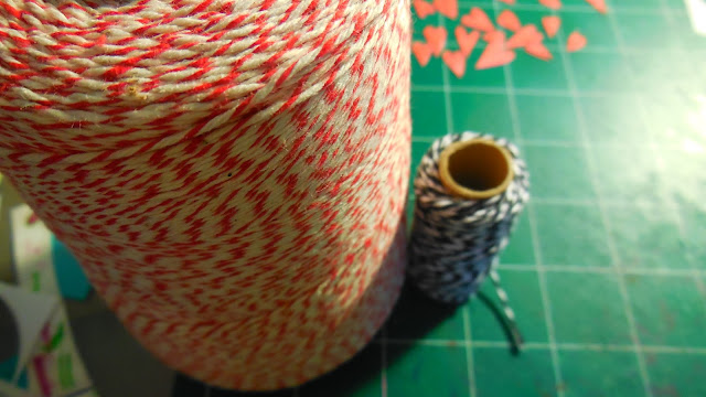
Then it was time to put the string on!  I used both red (which I'd never used before) and black.  You should cut two of each color, measured to 5 and 1/2 inches.
To make it look the best, I aligned the string with the corners on the chevron on the left.  After that, the eyelets went in on the right, and then the thank you piece in the middle.
Ta daaa!

Wednesday, September 16, 2015

Five Options... Which Will You Choose?

That title is suppose to look all ominous and stuff.  Me thinks it does not.  But on to the post!

Sad face.  Maggie didn't make any cards last week.  Or this week.  At all.

What?  No cards at all for a week and a half or more???  Shame on me, I know.  But guess what!  You, yes you, my dear reader, get to help me make one soon!  (Woot woot!)


This card has been sitting on my desk, half finished, for possibly weeks.  I haven't quite decided how to finish it.  But I was playing around with it the other day, thinking of different options I might go with, and then I had this super idea to let y'all choose what to do!  This will be so fun!

Okay, so maybe it won't be the highlight of your day or whatever, but please admit you'll get some enjoyment from it.  Please? Yay!

In an upcoming post, I'll show you a brief tutorial on how I made the card up to this point, and then I'll show you the finished card, so keep your eyes open!

And, here are your choices!  Vote away (over there on the right)!  The poll will be open until September 23, at midnight.  Hopefully that's plenty of time!

Note: Since I don't yet know which style I'm going to make, I didn't know what length the string would have to be cut to.  That means that when photographing each card idea, the string was still attached to the spools, and I didn't try to tie the knots and bows as well as I would for the actual card.  So if you see strings going off the card in an unnatural way, just know that it shouldn't look like that when I make the card later.  Also, I may tweak or change things a bit after y'all have picked which card style I'll use, but it will stay basically the same.

Again I say, get voting!
Option #1
Option #2
Option #3
Option #4
Option #5

Tuesday, September 15, 2015

How to Paint Paper With Pokeberry Juice

I'd like to point out first thing, that this project might not be the best if you have small chilluns around.  The juice from this stuff is not to be swallowed!  Trust me, my family has experience.

The stuff we're dealing with here comes from the Phytolacca americana plant, otherwise known as Pokeberry plant.  The berries are small, plump, and very fun to play with.  The juice looks exactly like blueberry juice does, but that's where the similarities stop.  They grow around here, so of course I couldn't help but incorporate them into my crafts!
I should probably note that I made this almost two weeks ago, when they were still here.  Now it's getting colder, and I wouldn't be surprised if they're gone.

A couple years or so ago, I covered a whole piece of cardstock paper with the juice from these.  I was very disappointed that the paper didn't stay bright pink, but instead turned a light brown.  Thankfully, it's kind of a pretty brown.  I still haven't used that paper to this day though...

Nevertheless,  I wanted to write a tutorial on how to make it, even though you could figure it out yourself!  Maybe I can inspire you to make some!

Since I still have a whole unused piece of paper covered in pokeberry juice, I'm only using scraps of white paper for this post, instead a whole new piece.
First you'll want to find a cup that you don't mind getting dirty.  It'll wash right out, but just to be safe, you might want to use an old paint cup or something, if you care about that.  You'll also need to get possession of something to mash everything up!  I used a skewer stick.  Lastly, if you're working on a surface such as your dining room table, or anything you don't want bright pink, sticky juice all over, I would definitely recommend laying down some newspaper.  I didn't do that because there's this nice table out on our porch that doesn't mind getting dirty (it's the one on our porch in the middle picture of my last post).
This is about one fourth of a cup, which was plenty for the amount of paper I was working with.
Mush, mash, mush!  It would work better to use something wider than a skewer, by the way.
Mmmm, look at that yummy goodness!  Haha, yummy goodness that you should not eat!
Once it's gotten mashed up enough to be liquid-y, you can spread it onto your paper of choice with a foam brush.  You also could use a paint brush probably.  It would give it a
The first strip I did was nice and smooooth.  All the others had patterns, or something that made them not one solid color.
These pictures are a bit too bright.  It doesn't actually look that bright pink, but pretty close.
The first one is not actually purple, as it looks in in the peektor.
These pictures were taken the day after.  You can see how much they faded already.
This last picture is even later.  As time goes on, they'll continue to get browner.
What else could you do with pokeberry juice?  (I love comments!)

Tuesday, September 8, 2015

Miniature Watercolor of Our House

I sent a letter to a camper today (using this card), and I didn't want to simply send a letter, plus it's always fun to get a little something extra, so I made this real quickly to pop in there!

I was inspired by the watercolors on Little Girl Designs and The Thinking Closet.  I just love how carefree and...beautiful they look!  I especially love the look of black pen (sharpie in my case, of course) with watercolors.

 Too.  Cute.  Just sayin'.
 Toto didn't want to move.
 LOVE this picture.
 I can't figure out how to keep the words on the right hand side from overlapping the pictures when they're this big, but they look the best when they're huge!  [Update: Anna holped, and we figured it out!]

What'cha think?

Wednesday, September 2, 2015

Bulletins: Introduction

I'm starting a new series on using church bulletins on your cards!  That sounds a little strange, doesn't it?  Out of the ordinary, perhaps?  I don't mean I'm just going to use the bulletins as they are.  How boring that would be!  (Okay, I'm sure you could make it interesting.  I, of all people, should believe that.)  But what I'm going to do is use all those bulletins that I doodled on in church.  I have so many that I don't want to throw away because the doodles are so pretty.  What better way to use them than on cards?  (I'm sure there are many creative ways to use them, but my specialty happens to be card-making.)  And that is exactly what I intend to do!  I have sooo many doodled-on bulletins, so this series may never end!  Some of them, most in fact, are doodled by me, but there are a few that I've kept that have been done by others.

I will primarily be using Shiloh OPC bulletins, since that's where I go to church, but sometimes there might be other church bulletins, or random papers that aren't even bulletins at all!  That would only happen because we were at some event where I received a brochure which got doodled on.  I can cheat, right?

As I started to write this just now, I realized that maybe I'm not suppose to have multiple series going on at one time.  I don't think my favorite craft blog ever has more than one series going on at once.  Hmm.  Well, blogging is all about figuring out what works best for you, isn't it?  (More or less...)

Below is [most of] my bulletin collection.  I really only needed one picture, but, you know, why not add more?
Hope this series will give you some inspiration or ideas of how to use those pretty doodles you don't want to throw away!  Or maybe it will just give you more creativity in your doodling.  Either one works, I suppose!